
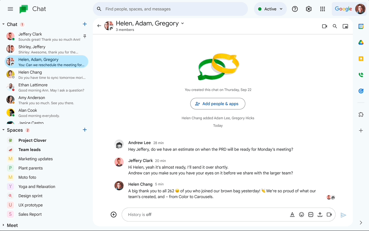
Google Drive, Docs, Sheets, Slides, and Gmail have all received new interfaces, and Google Chat is no exception. This one is also built on Google’s Material Design 3 system, just like the makeovers it rolled out to its other Workspace apps.
The entire user interface has seen minor changes, including rounded buttons (and a rounded search bar) and blue accents scattered throughout. The main message view, compose setup, new topic button, and thread panel within direct messages and spaces have also undergone some changes.
Earlier this week, Google also unveiled a new Chat feature that lets Space Managers create announcement-only channels, similar to what is possible in Slack. Having a designated announcements space means you won’t have to search through a lot of chats to find an important update, which is a helpful method to keep all team members up to date.
Although the redesign doesn’t bring any unexpected changes, at least now you’ll know why your Google Chat has a slightly different appearance as it gradually launches over the coming weeks.
